Overview
Role: UX Researcher & UI/UX Designer
Team: 4 designers
My contribution: Early research, competitor analysis, logo + icon design, style guide, wireframes, prototyping collaboration
Deliverables: Research insights, IA + wireframes, UI style guide, high-fidelity prototype (team-built)
Tools: Figma (prototype), research synthesis, competitor analysis
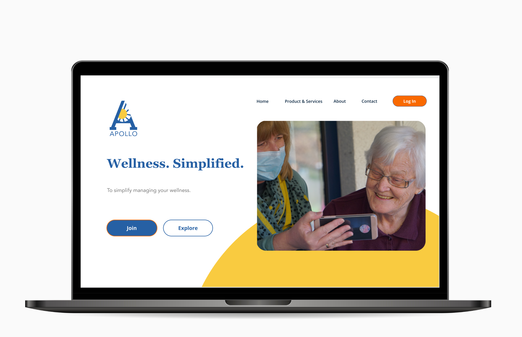
Apollo is a wellness-focused prescription management app with the mission to simplify managing prescriptions and refills—helping users prioritize their well-being with less stress and fewer missed doses.
Medication adherence is a widespread challenge: approximately one in five new prescriptions are never filled, and among those that are filled, about 50% are taken incorrectly (timing, dosage, frequency, or duration). This leads to significant health consequences and is associated with $100–$300 billion in avoidable U.S. healthcare costs annually.
Apollo was designed to address these real-world barriers by focusing on the moments when users struggle the most:
• keeping track of refills and daily routines
• understanding medication instructions
• managing cost concerns and anxiety around prescriptions
• staying motivated and consistent over time

Design Thinking Process (How we approached the problem)
Using the Design Thinking framework, our team moved from exploration to defined solutions through a structured, research-driven workflow.
Discovery + Ideation
To generate and narrow down meaningful solutions, we used:
• Time-boxing to drive fast ideation and prevent over-designing early concepts
• Mind mapping to explore the ecosystem around prescription management (refills, reminders, community, pharmacy access, doctor communication)
• Affinity diagramming to synthesize and organize research patterns into key themes and opportunities
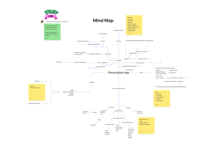
Mind map created during Design Thinking discovery to capture the ecosystem (refills, reminders, cost, wellness goals) and expand opportunity framing.
User Understanding Artifacts
To ensure we were designing for real needs (not assumptions), we created:
• Personas representing different medication-management behaviors and routines
• Empathy maps to capture users’ emotional context (stress, uncertainty, fear of missing doses)
• Journey maps to identify critical pain points across the full experience—from getting a prescription to staying consistent long-term
Research Synthesis (What we learned)
Research Activities
We used a combination of:
• Screening questions to identify participants and understand baseline medication behaviors
• User interviews to explore motivations, routines, pain points, and prescription anxiety
• Affinity diagramming to synthesize patterns across interview notes
• A theme frequency review to prioritize the most impactful user problems
This process helped us move from qualitative insights into clear, design-ready priorities.
After synthesizing findings, several recurring themes surfaced. Users struggle most with:
• refill tracking and timing (forgetting, uncertainty about remaining meds)
• trust and clarity in medication instructions (fear of taking it wrong)
• cost pressure, which can lead to delaying refills or rationing medication
• routine disruption—travel, busy schedules, stress, and life changes
These insights helped shape Apollo into an experience centered on reducing friction, increasing clarity, and supporting users with a calm, confidence-building interface.
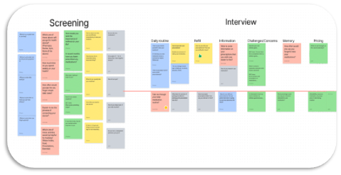
Affinity diagram created from user interview notes to identify behavioral patternsand group insights into themes for prioritization and solution direction.
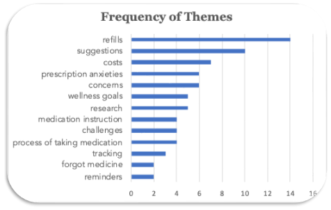
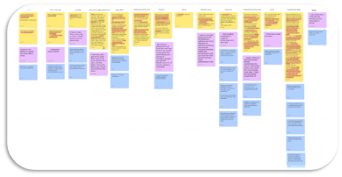
Theme frequency summary showing how often key topics appeared in research—supporting evidence-based prioritization for the product roadmap.
Synthesis
After synthesizing findings, several recurring themes surfaced. Users struggle most with:
• refill tracking and timing (forgetting, uncertainty about remaining meds)
• trust and clarity in medication instructions (fear of taking it wrong)
• cost pressure, which can lead to delaying refills or rationing medication
• routine disruption—travel, busy schedules, stress, and life changes
These insights helped shape Apollo into an experience centered on reducing friction, increasing clarity, and supporting users with a calm, confidence-building interface.
Affinity Diagram (Synthesis Method)
After interviews, we translated raw notes into an affinity diagram, clustering observations into meaningful categories. This method allowed our team to:
• identify repeated behaviors and frustrations
• distinguish between surface-level complaints and root causes
• align on what mattered most before jumping into UI decisions
The result was a set of clear opportunity themes that guided our product direction.
Frequency of Themes (Prioritization)
Once themes were established, we examined which topics appeared most frequently across users.
The most common themes included:
1) Refills (highest frequency)
2) Suggestions / medication guidance
3) Cost concerns
4) Prescription anxiety and uncertainty
5) Health and wellness goals
6) Tracking adherence progress
7) Reminders (lower frequency but high impact)
Why this mattered
Frequency helped us prioritize, but we also considered severity and risk:
Even themes mentioned less often (such as forgetting medication) can have high consequences.
Even themes mentioned less often (such as forgetting medication) can have high consequences.
Final Problem Statement
Based on insights from user research and persona development, we defined the core problem statement to guide design decisions for Apollo.
Medication management is a high-stakes routine, yet many users struggle with refills, instructions, cost pressure, and daily adherence. Research shows ~20% of new prescriptions are never filled and ~50% of medications are not taken as prescribed—leading to preventable health risks. Apollo reduces these barriers through a simplified, supportive experience that helps users manage prescriptions and refills with confidence.
How might we help users manage prescriptions and refills with less friction and anxiety—so they can follow medication routines consistently and confidently?
Success Criteria
A successful Apollo experience should help users:
• track refills and reminders without manual effort
• understand medication instructions clearly (what, when, how)
• reduce missed doses through routine-friendly design patterns
• increase user confidence through transparency and confirmation
• support multiple prescriptions with minimal cognitive load
Key Research Insights (What we learned)
Based on synthesis, the research revealed 5 critical insights:
1) Refill uncertainty creates stress and missed action
Users often don’t know:
• when they should refill
• how many days remain
• whether a refill is still available
This leads to delayed refills and avoidable frustration.
2) Users want guidance, not just reminders
Many users seek support with:
• understanding prescriptions
• side effects
• what to do if they miss a dose
They want “confidence-building information,” not just notifications.
3) Cost shapes behavior
Users frequently make refill decisions based on:
• insurance coverage uncertainty
• comparing options
• avoiding unexpected prices
Cost stress can lead to delayed refills or rationing medication.
4) Prescription anxiety is real
Some users experience anxiety about:
• taking medication incorrectly
• mixing medications
• misunderstanding instructions
This makes clarity and trust essential.
5) Tracking motivates adherence
Users feel more successful when they can:
• confirm progress
• see streaks or history
• feel in control of routines
How Insights Shaped the Product (Traceability)
Research Insight → UX Decision Mapping
Insight: Refill confusion is the most frequent pain point
Design decision: Introduced refill visibility patterns: refill status, timeline cues, and clear refill actions
Design decision: Introduced refill visibility patterns: refill status, timeline cues, and clear refill actions
Insight: Users want guidance and clarity
Design decision: Included structured medication information architecture: dosage, frequency, and easy-to-scan instructions
Design decision: Included structured medication information architecture: dosage, frequency, and easy-to-scan instructions
Insight: Cost concerns influence adherence
Design decision: Created transparency moments (pricing cues / support messaging) to reduce uncertainty and friction
Design decision: Created transparency moments (pricing cues / support messaging) to reduce uncertainty and friction
Insight: Anxiety decreases confidence
Design decision: Added reassurance patterns: confirmation states, simple language, and predictable navigation
Design decision: Added reassurance patterns: confirmation states, simple language, and predictable navigation
Insight: Progress motivates habit-building
Design decision: Added tracking patterns (history, completion, routines) to reinforce adherence behavior
Design decision: Added tracking patterns (history, completion, routines) to reinforce adherence behavior
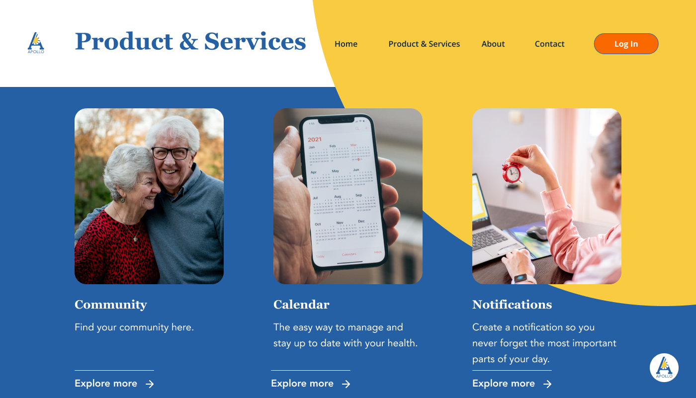
Style Guide
To ensure Apollo could scale consistently across screens and future features, our team created a lightweight design system defining core UI foundations and reusable components. This system helped maintain a clear visual hierarchy for complex medication workflows while supporting accessibility, speed of iteration, and consistency across the prototype.
The design system included:
• typography hierarchy and spacing rules
• color palette with contrast considerations
• button, input, and card components
• notification/reminder patterns
• consistent layout grid for dashboard-style screens
his system ensured that high-frequency actions (refill, reminder, confirm) remained visually consistent and easy to recognize—reducing cognitive load in routine medication tasks.
Design system foundations (typography, color, spacing, UI components) used to maintain accessibility and consistency across Apollo’s prescription and refill workflows.