Overview
Role: UX Researcher & UI/UX Designer
Team: 4 designers
My contribution: Early research, competitor analysis, logo + icon design, style guide, wireframes, prototyping collaboration
Deliverables: Research insights, IA + wireframes, UI style guide, high-fidelity prototype (team-built)
Tools: Figma (prototype), research synthesis, competitor analysis
Research Background (Market + User Context)
The music industry has shifted heavily toward streaming, but many rising artists still face challenges turning listens into income. While streaming platforms help discovery, financial support tools are often either unavailable, hard to find, or not designed as a core user journey.
Our early research focused on one key question:
How might we make supporting rising artists feel as natural and easy as listening to their music?
The Challenge
Independent and rising artists often struggle to monetize their work consistently. Existing music platforms are optimized for listening, but donation and direct support flows are often unclear, buried, or emotionally disconnected from the artist’s story.
Goal: Design a donation feature that feels:
• simple (low friction)
• trustworthy (users feel safe donating)
• emotionally meaningful (supporting artists feels personal)
My Role
I worked as the UX Researcher and UI/UX Designer in a team of four. I contributed across the project lifecycle from discovery to prototyping.
My responsibilities included:
• Supporting market research to understand the music streaming landscape and donation-based models
• Conducting early user research (discovery) to identify potential user needs, motivations, and pain points around supporting rising artists
• Performing competitor analysis to evaluate strengths/weaknesses of existing music platforms and support features
• Designing the Solus logo and app icon
• Creating the UI style guide (typography, color system, spacing, and component consistency)
• Developing wireframes and key user flows, including the donation journey
• Collaborating with teammates to create the final interactive prototype
• I helped translate research insights into design decisions by aligning user needs with business goals and usability best practices.
Early Research (Discovery)
To shape the first version of Solus, our team conducted early-stage research including:
• Market research on music streaming and direct-to-artist support models
• Competitor analysis of music applications and donation-based platforms
• Exploratory user research to understand motivations and concerns around donations
• Insight synthesis to identify patterns in user expectations and trust behaviors
Competitor Analysis
We studied popular platforms and compared:
• ease of donation access
• clarity of donation steps
• emotional connection (artist story / identity / trust)
• transparency (where the money goes)
key Findings
• Donation features are often hidden or take too many steps
• Users feel hesitant when the app lacks trust and transparency
• The best experiences make donating feel quick, personal, and rewarding
Tools
Our team used some Design Thinking Tools to gather information that informed our next design decisions. The tools used include: Affinity Diagram and FigJam.
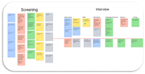
An Affinity Diagram was used to narrow down interview questions/ideas.
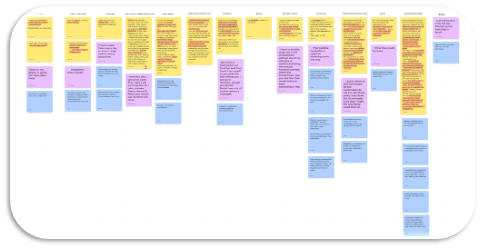
Coded interview transcripts transferred in FigJam to sort the most popular themes.
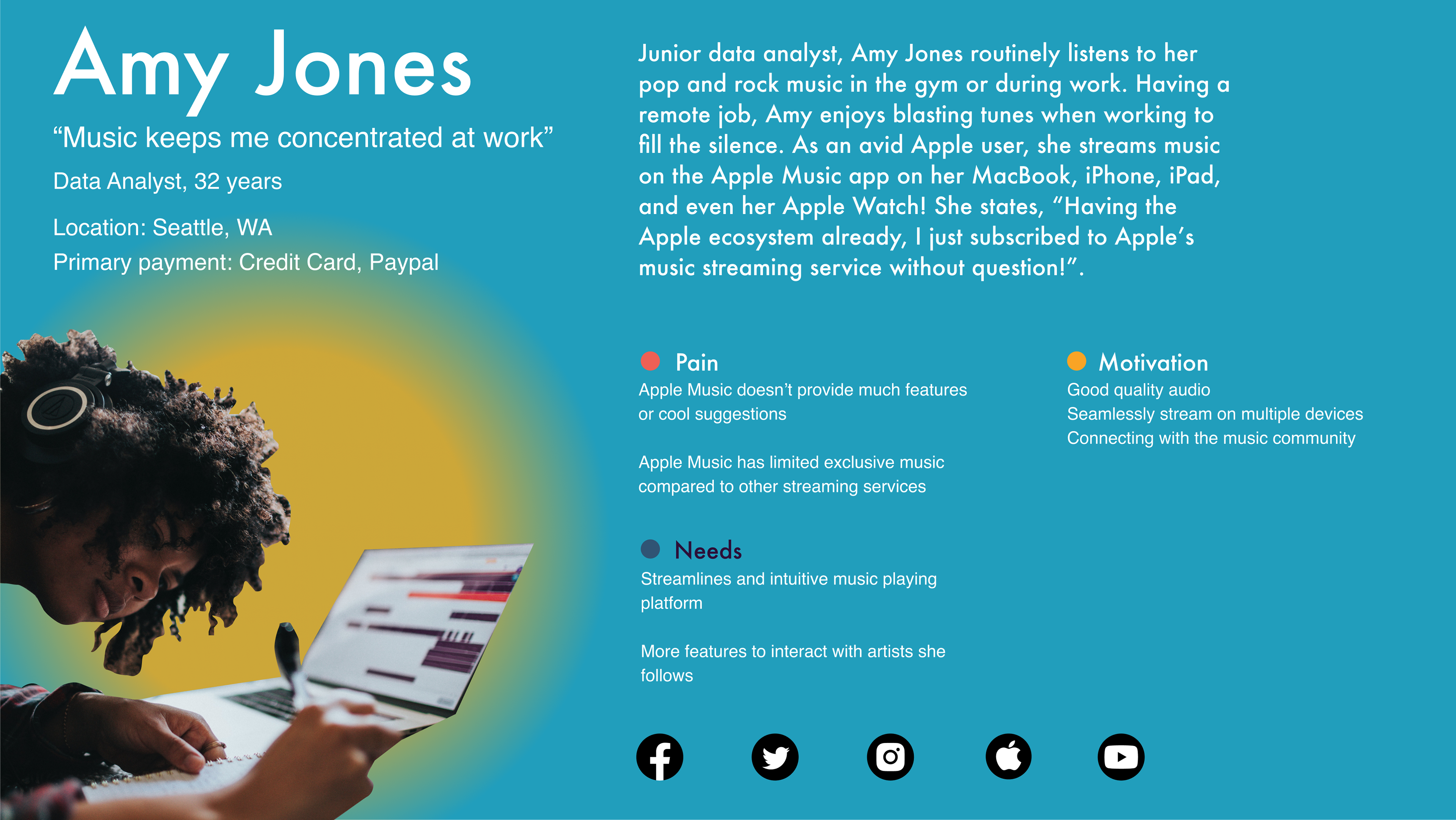
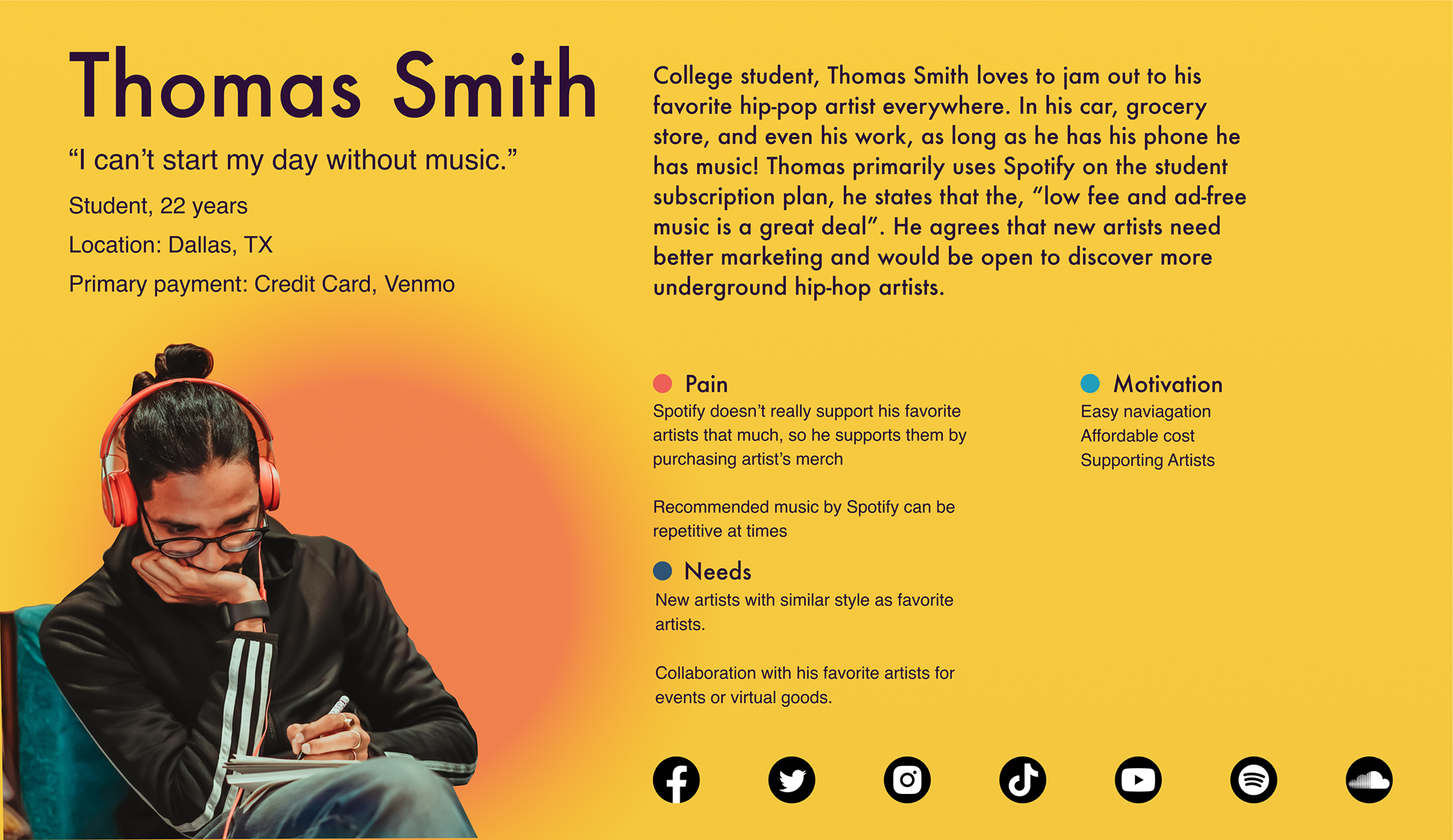
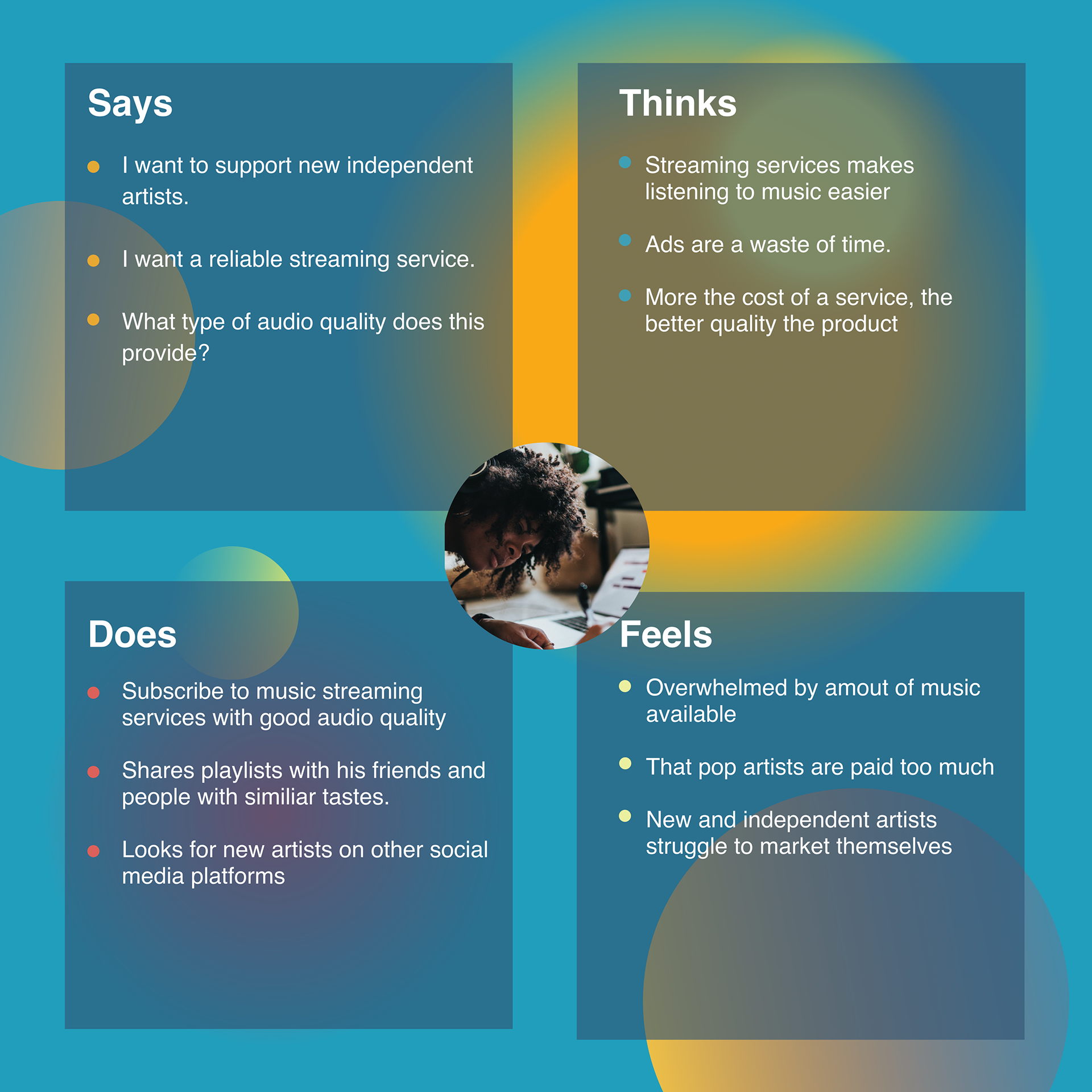
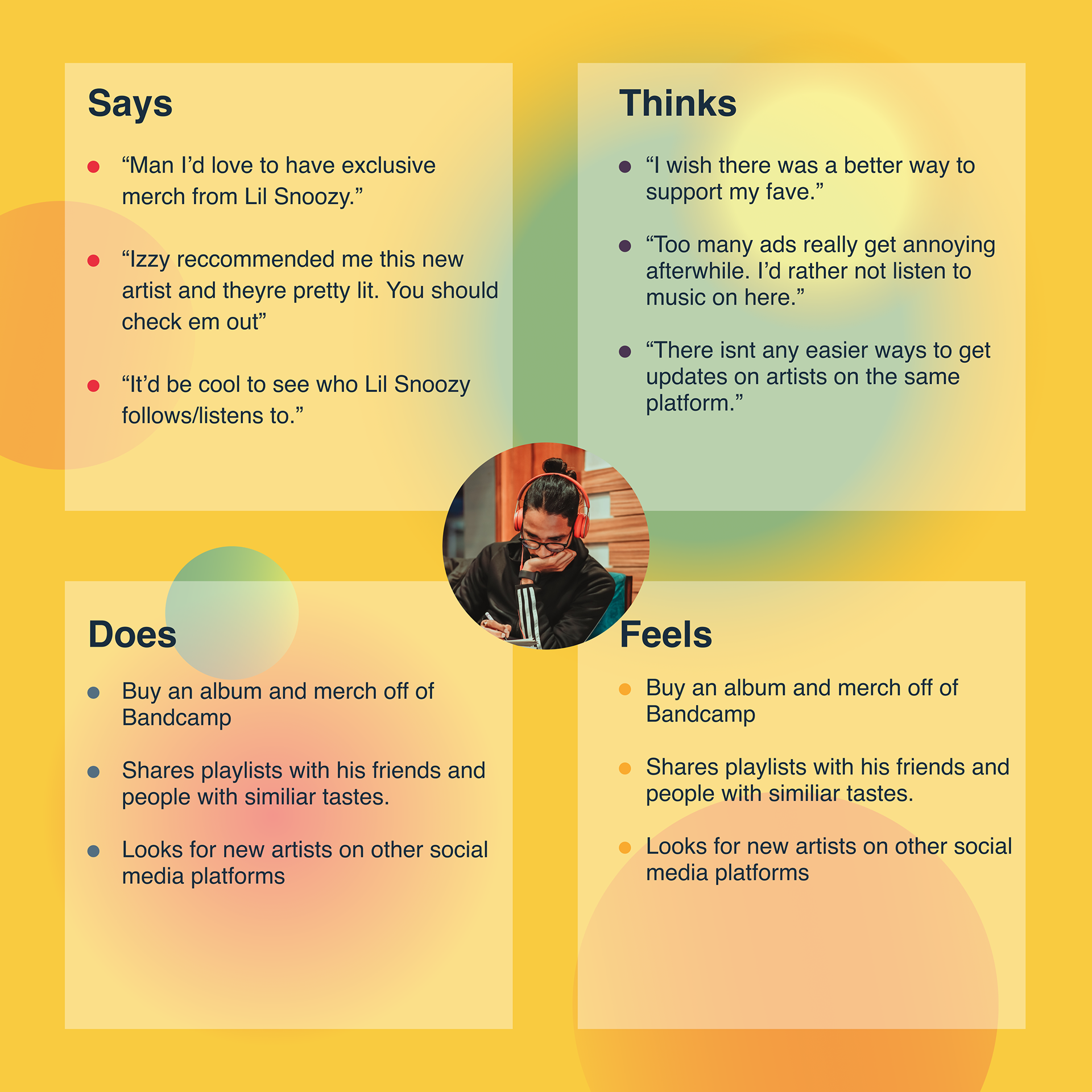
Personas
To better understand how different users discover music and support artists, we developed two primary personas representing key segments of our target audience. These personas helped us define motivations, pain points, and donation behaviors, and guided design decisions around discoverability, trust, and ease of contribution.
Empathy Maps
3 Key Insights (derived from personas)
1) Donation is emotional, not transactional
Users like Amy are more likely to donate when the experience feels personal—connected to the artist’s identity and story.
Users like Amy are more likely to donate when the experience feels personal—connected to the artist’s identity and story.
2) Trust and transparency directly affect willingness to donate
Both personas hesitate when it’s unclear where the money goes or when confirmation feels weak—trust cues are essential.
Both personas hesitate when it’s unclear where the money goes or when confirmation feels weak—trust cues are essential.
3) Micro-support works best when friction is removed
Users like Thomas are open to supporting artists with small amounts, but only if donating is quick, easy, and integrated naturally into the listening flow.
Users like Thomas are open to supporting artists with small amounts, but only if donating is quick, easy, and integrated naturally into the listening flow.
Final Problem Statement
Based on insights from user research and persona development, we defined the core problem statement to guide design decisions for Solus.
Rising artists struggle to receive consistent support through traditional streaming platforms, while listeners who want to help often face friction, low discoverability, and limited trust in donation experiences. Solus bridges this gap by integrating a seamless, accessible donation flow into the listening journey—making support feel natural, personal, and effortless.
How might we enable music listeners to support rising artists through a donation experience that is simple, trustworthy, and emotionally rewarding?
Design Strategy
Based on the research insights, the design direction focused on:
1) Reduce friction
Donation should be accessible in 1–2 taps, not buried inside menus.
2) Build trust
Donation screens should include:
• artist identity + authenticity
• confirmation and transparency messaging
3) Keep it human
Supporting artists should feel like:
“I’m helping a real person” not “I’m paying an app.”
“I’m helping a real person” not “I’m paying an app.”
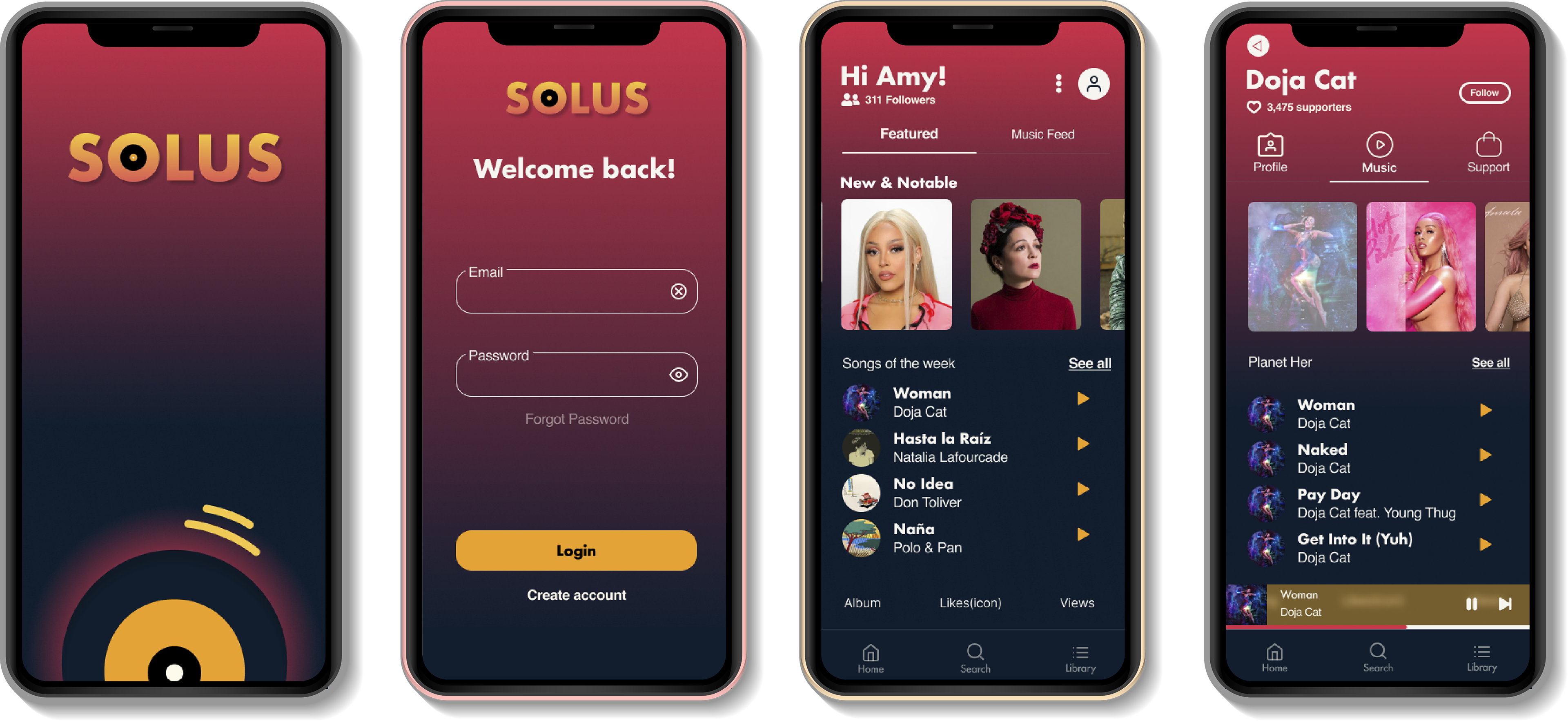
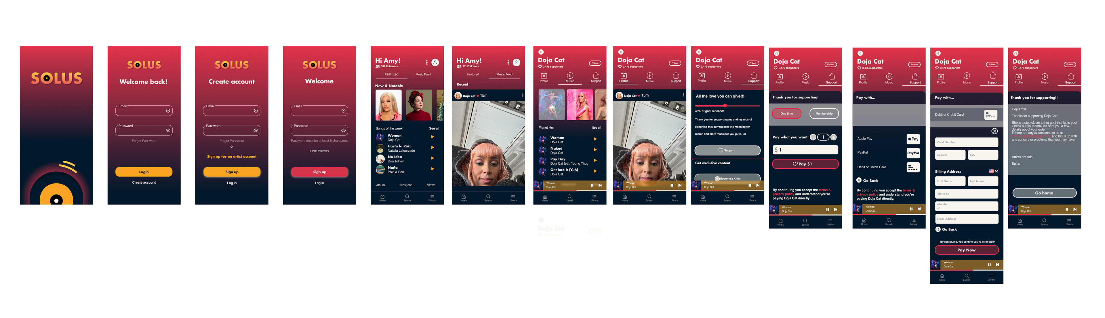
UX Deliverables
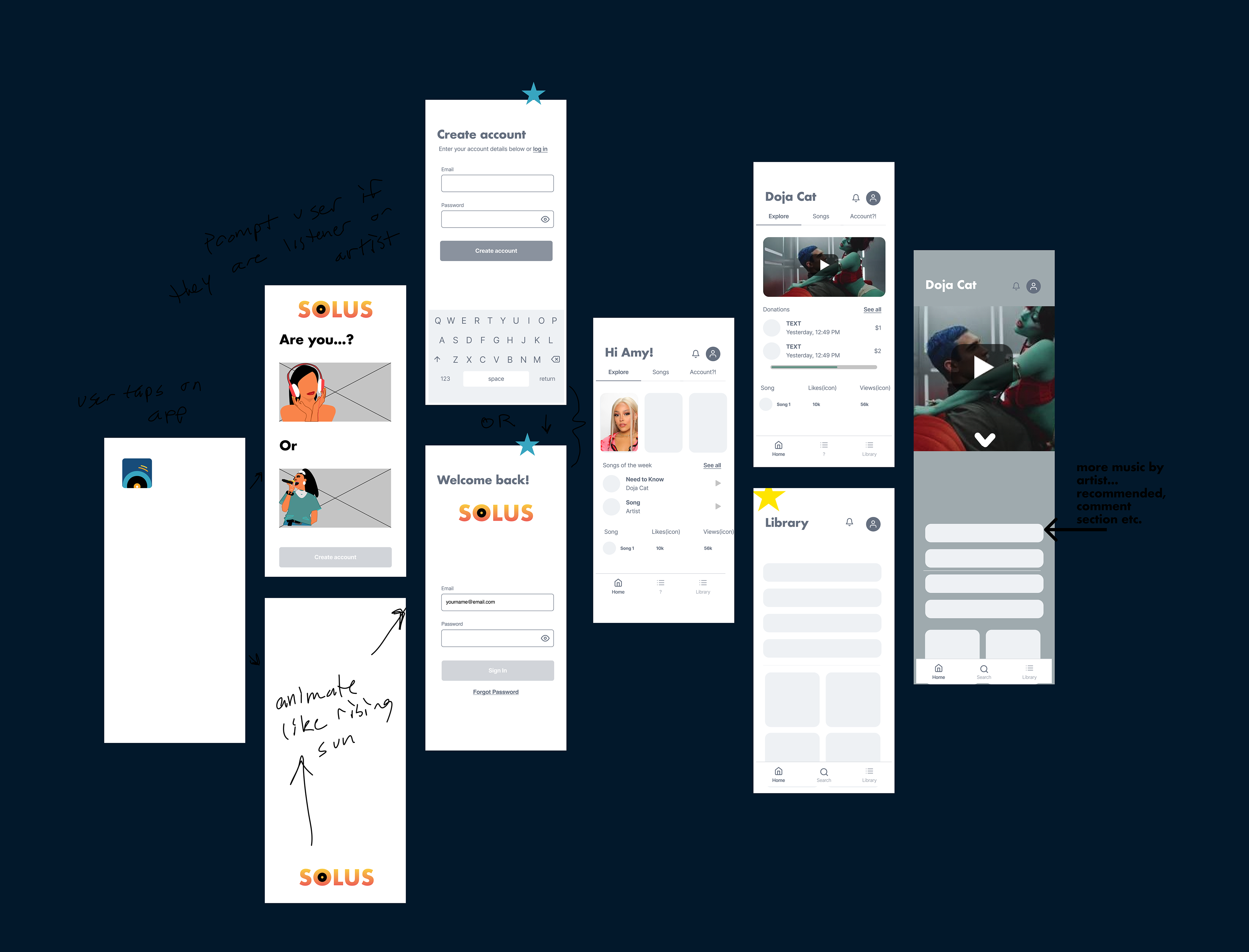
Wireframes
I designed core flows, focusing on:
• discovering an artist
• selecting donation amount
• confirming the donation
• receiving confirmation and emotional reward
UI Style Guide
I developed the visual style system to ensure:
• consistent spacing and typography
• accessible contrast
• clear interaction hierarchy (primary vs secondary actions)
Company's Logo
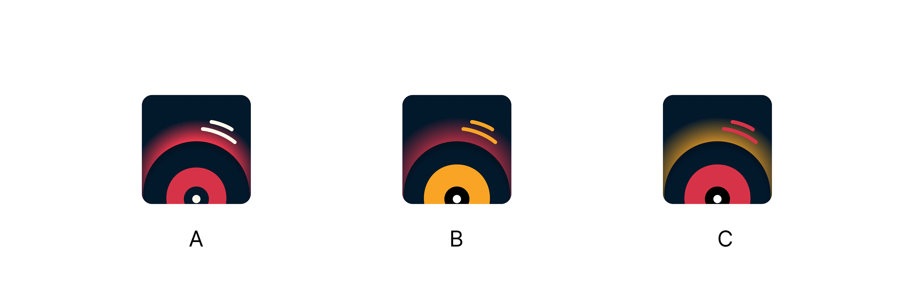
Usability Testing
We implemented some Usability Testing to find out which icon communicates more efficiently with users.
The Usability Testings performed include: Preference Testing, and A/B Testing.

Wireframe
Using the Usability Testing results, some sketches were created. To visualize the key pages, the team also collaborated to make a lo-fidelity wireframe . The application wireframe was used as the blueprint to visualize the user flow for Solus application
Impact (Prototype outcome)
The result was a collaborative interactive prototype, demonstrating a streamlined experience for supporting rising artists through a donation-first flow.
Although this was a concept prototype, our design decisions aimed to:
• reduce the donation flow to fewer steps
• increase discoverability of support features
• strengthen user trust through transparency patterns
Reflection (what I learned)
This project strengthened my ability to:
• translate early research into actionable UX strategy
• simplify complex flows into emotionally resonant experiences
• collaborate across team roles while owning key design deliverables